 VANTAGE Windows & Doors
 Roofing Industries
 ALTHERM Window Systems
 Dimond Roofing
 Juralco Aluminium
 SPAX
SPAX


 Prolam
 Case Studies
 PGH Bricks
 Metwood






 Porter's Paints




For more than three decades, Porter’s Paints has been synonymous with handcrafted colour, artisan finishes, and a philosophy that values depth, nuance, and authenticity over fleeting trends. The launch of the new Colour Library marks the brand’s most significant colour evolution in ten years, a considered and confident step forward that reinforces Porter’s position as a leader in premium architectural and decorative paint.
A decade in the making
The new Colour Library is the result of extensive collaboration with customers and industry partners across Australia and New Zealand. It responds directly to how colour is being specified, experienced, and lived with today, across residential, hospitality, and commercial environments.
At its core is Porter’s enduring commitment to quality and craftsmanship. Each colour has been hand designed using layers of exclusive tinters, creating a distinctive depth and softness that has become a hallmark of the brand. These are colours that feel alive, shifting subtly with light and environment, and rewarding close attention over time.
Designed for New Zealand light and landscape
The palette has been carefully refined to resonate with New Zealand sensibilities. Drawing on natural references and the subtleties of local light, the colours evoke calm, warmth, and a sense of belonging. From soft whites and nuanced neutrals to earthy terracottas, muted greens, blush tones, and warm yellows, the collection feels grounded, timeless, and deeply connected to place.
Rather than following trends, the Colour Library offers longevity, colours that sit comfortably within a wide range of architectural styles while remaining relevant for years to come.
A comprehensive colour specification tool
The 2025 Colour Library features 300 curated hues, thoughtfully organised into five concertina fan decks:
- Neutrals and Browns
- Greys and Blacks
- Whites and Off Whites
- Blues and Greens
- Yellows, Pinks and Reds
The collection includes 34 new colours alongside 80 re-imagined shades from Porter’s archive, ensuring continuity for existing specifications while introducing fresh creative possibilities.
Each colour is presented with clear, practical descriptions, and the printed samples are finished true to colour, providing confidence from studio to site. Compact and portable, the fan decks are organised by tonal depth and can be folded to view complementary colours side by side — simplifying palette building, specification, and client conversations.
“This premium resource is designed to empower specifiers with greater confidence, accuracy, and enjoyment in the colour selection process,” says Jeremy Meates, Business Development Manager at Porter’s Paints New Zealand.
Colour with emotion, texture, and depth
Every shade in the Colour Library has been designed to evoke emotion and create atmosphere. The palette is intentionally versatile, allowing designers to build calm, restrained schemes or more expressive, layered interiors.
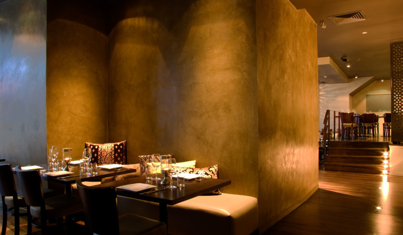
To further enhance warmth and tactility, the colours have been developed to work seamlessly with Porter’s signature decorative finishes, including Fresco and French Wash. When paired together, colour and texture create surfaces that feel rich, imperfect, and human, qualities that sit at the heart of Porter’s design philosophy.
A philosophy that values authenticity
Speaking at the New Zealand launch, Scott Wishart, General Manager of Porter’s Paints, reflected on the brand’s evolution since joining the Dulux family in 2015, noting a renewed focus on colour innovation and artisan finishes, while preserving what makes Porter’s distinct.
“At the heart of Porter’s is a belief in authenticity over uniformity,” Scott says. “Our colours are designed to respond to light and environment, creating spaces that are layered, expressive, and full of character. This philosophy continues to resonate with designers seeking finishes that feel individual and enduring.”
Supporting the design community
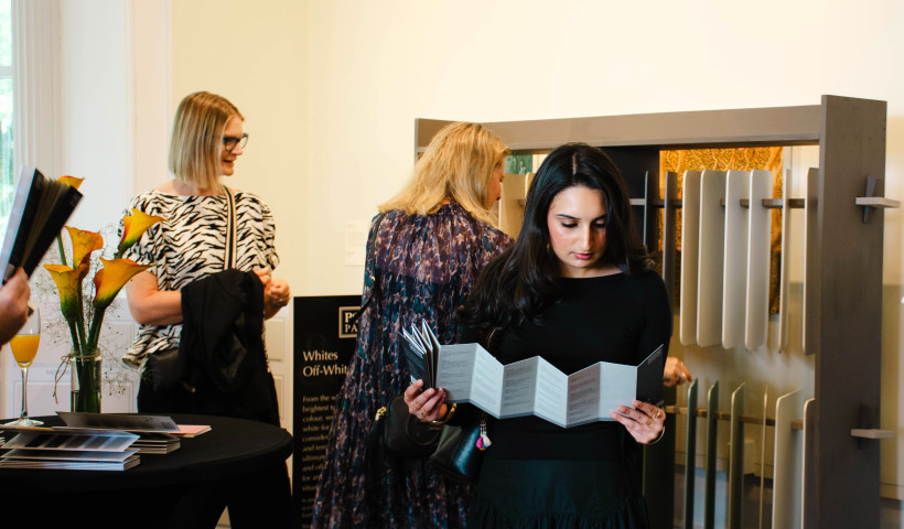
The launch of the new Colour Library was celebrated at the Arts House Trust at the Pah Homestead in Auckland, a venue closely aligned with creativity and craftsmanship. The event brought together architects, designers, specifiers, and media, reinforcing Porter’s long standing commitment to supporting the design community through education, inspiration, and meaningful tools.
Guests received a complimentary set of the new Colour Library, underscoring Porter’s dedication to making high quality colour resources accessible and practical for everyday specification.
A new chapter for Porter’s Paints
The new Colour Library signals a confident new chapter for Porter’s Paints in New Zealand that is built on decades of expertise, deep engagement with the design community, and an unwavering commitment to colour with integrity.
As these colours find their way into homes, hospitality venues, and commercial spaces across the country, they will continue to do what Porter’s colours do best: tell stories through light, texture, and time.
 Popular Products from Porter's Paints


 Most Popular

 Popular Blog Posts