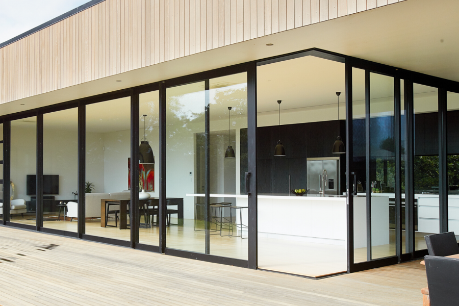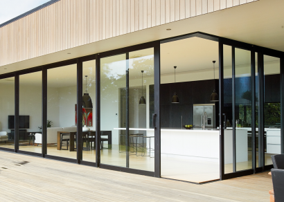
 VANTAGE Windows & Doors
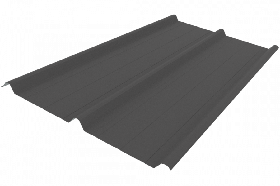
 Roofing Industries
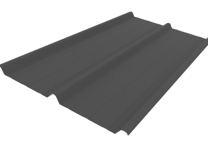
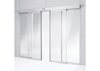
 dormakaba
 XLam Cross Laminated Timber Panels
 SPAX
SPAX


 Bates Surfaces
 Case Studies
 JESANI
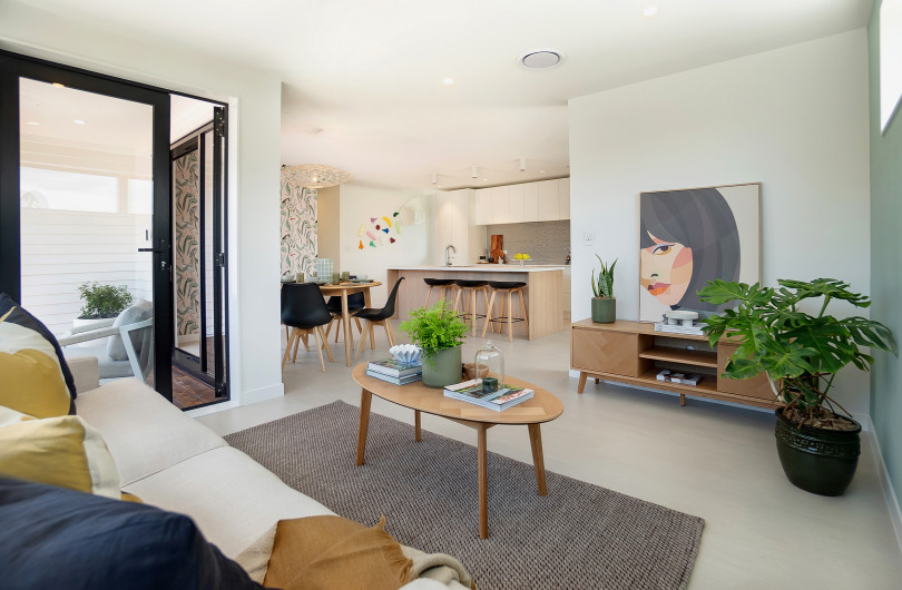
 Aero
Aero


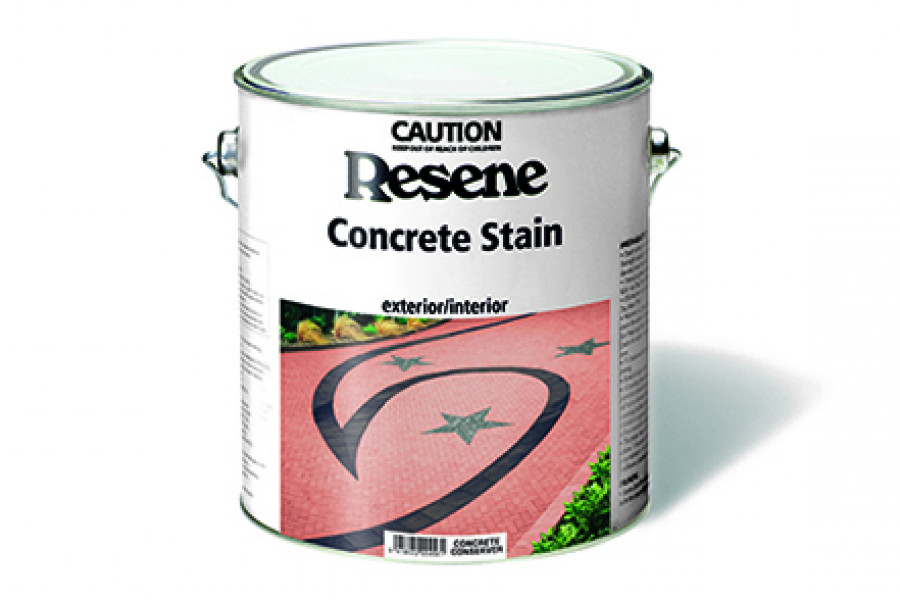
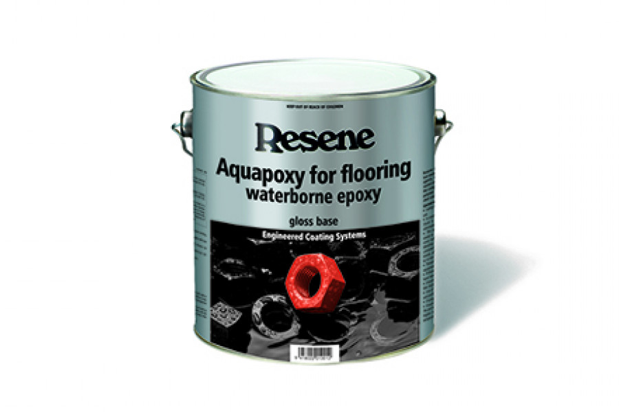
 Resene


 NEW
NEW
As we age we tend to look at life differently – and we literally see it differently as well. The lenses of our eyes begin to yellow, causing a reduction of clarity. Pale colours and colours of similar intensities become more difficult for the ageing eye to discriminate, so a higher contrast in colours may be needed to discern various items around us.
Additionally, "The muscles that control our pupil size and reaction to light weaken, causing the pupils to become smaller and less responsive to changes in ambient lighting," says eye-care specialist Dr Gary Heiting. "Because of these changes, people in their 60s need three times more ambient light for comfortable reading than those in their 20s."
Elderly people who spend a good deal of time in pale surroundings with little contrast may find themselves feeling depressed by the drabness of the colours they perceive. As they become less active, with diminished eyesight and hearing, they may also feel less secure. That’s one reason why we tend to lean towards more intense, warmer colours as we get older.
"When you’re younger you tend to look for colour, so you test yourself and use some of the brighter colours," says interior designer and colour consultant Debbie Abercrombie.
"Then when you get to the middle ages, like me, you typically don’t want anything demanding. I’ve gone from having reds and oranges in my home – I want to just come home to neutral right now. My life is busy, and a lot of colleagues are in my position. We still like colour around us but maybe splashes," explains Debbie.
"But older people, I’m finding, want more colour again – warm rich colours. They are looking for warmth and security. Because life is probably quieter and less demanding, they have got more time and they want colour back in their homes. Maybe they are not getting out and about as much."
Richer colours also address the need for brighter light in rooms, as vibrant colours bounce more wavelengths of light back to the eye than low saturation colours do. Richer colours can easily be introduced via walls, décor and accessories. A warm brick fireplace with comfortable chairs in rich golden colours evokes a warm, cosy atmosphere, for example.
Debbie often works with warm colours like reds, golds, browns and greens. From the Resene Karen Walker paint palette, she utilises colours like Resene Sanguine Brown, a soft earthy red-brown, Resene Sorrell Brown, a warm golden beige, Resene Kina Brown, a darker salty brown, and Resene Calm Green, a dense green-grey.
 Popular Products from Resene
 Posts by Resene Technical
 Most Popular