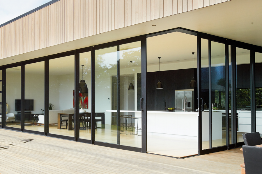
 VANTAGE Windows & Doors
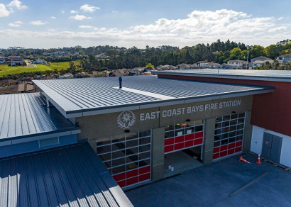
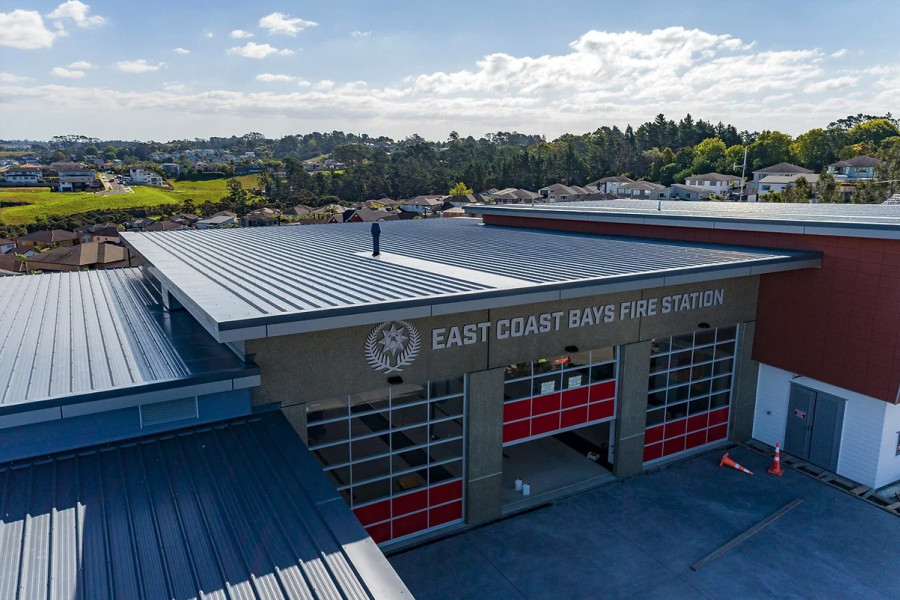
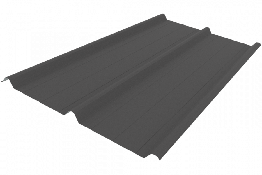
 Roofing Industries
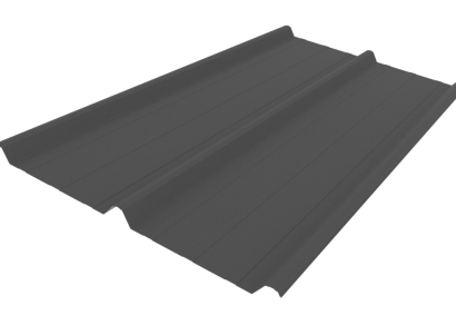
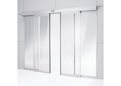
 dormakaba
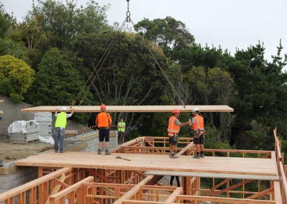
 XLam Cross Laminated Timber Panels
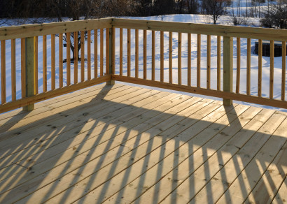
 SPAX
SPAX


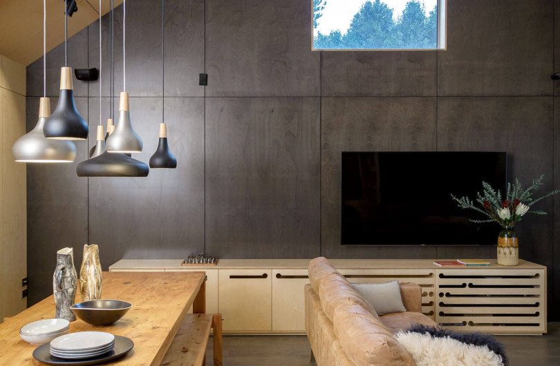
 Bates Surfaces
 Case Studies
 JESANI
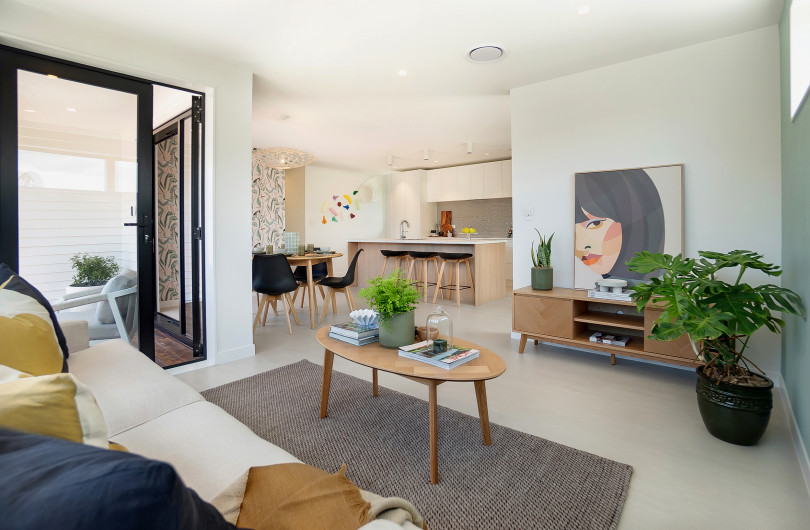
 Aero
Aero


 Dulux
Dulux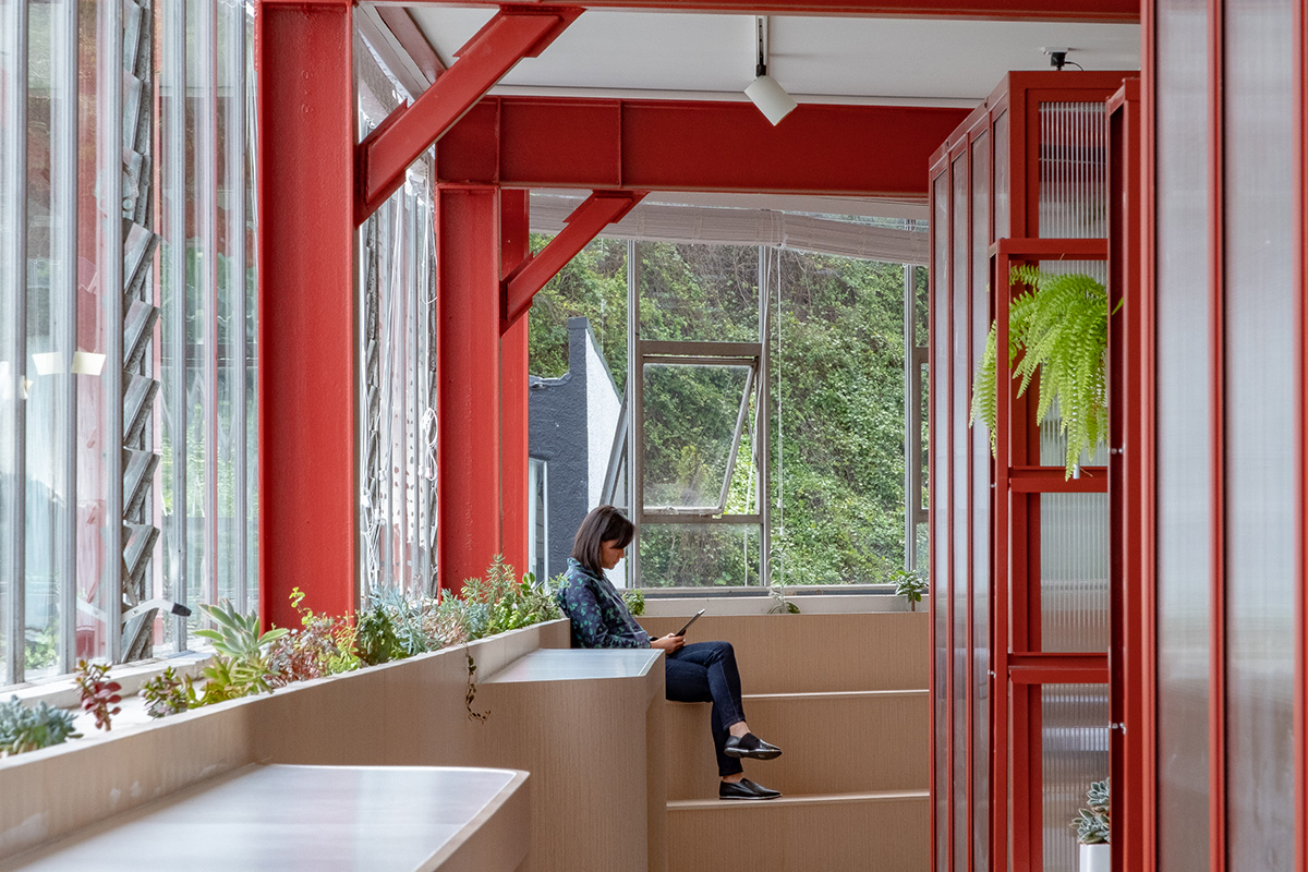


 Licensed")

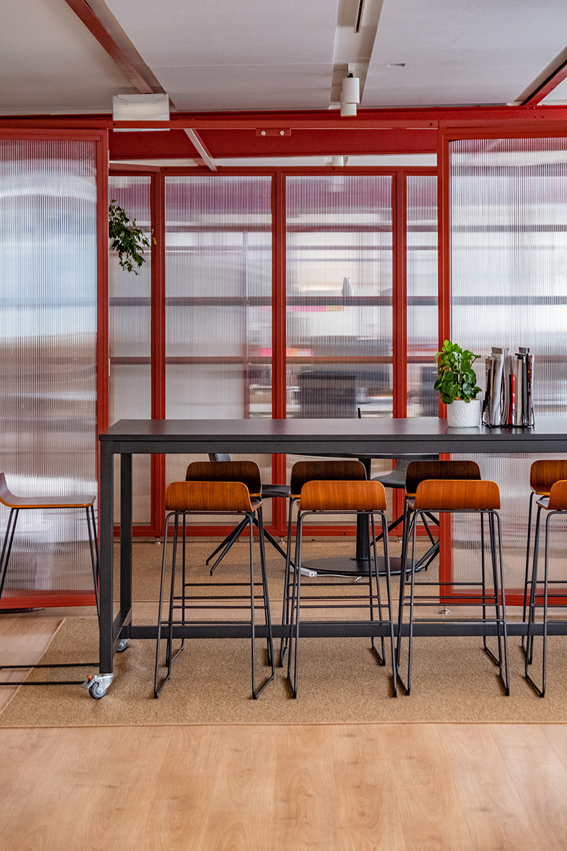
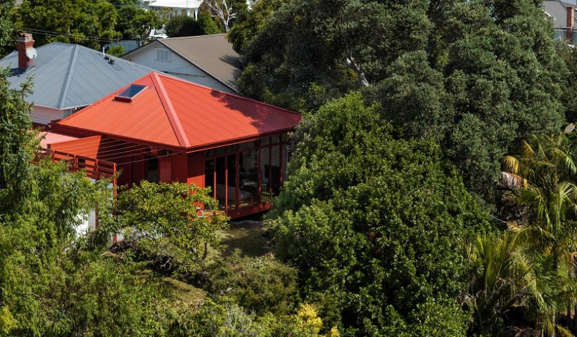
Crimson Education Office by Patrick Loo from OPL and Brian He from Crimson Education, took out the top prize in the Dulux Colour Awards 2018 International Category with its bold and modern design.
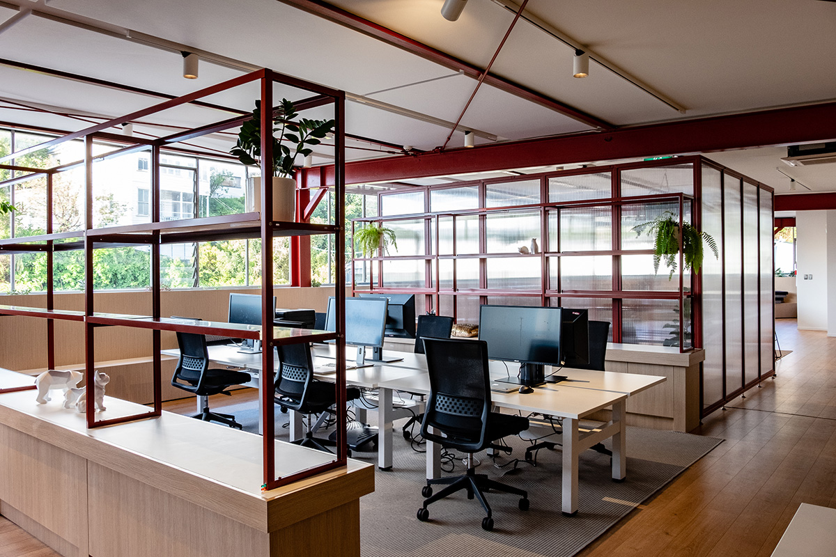
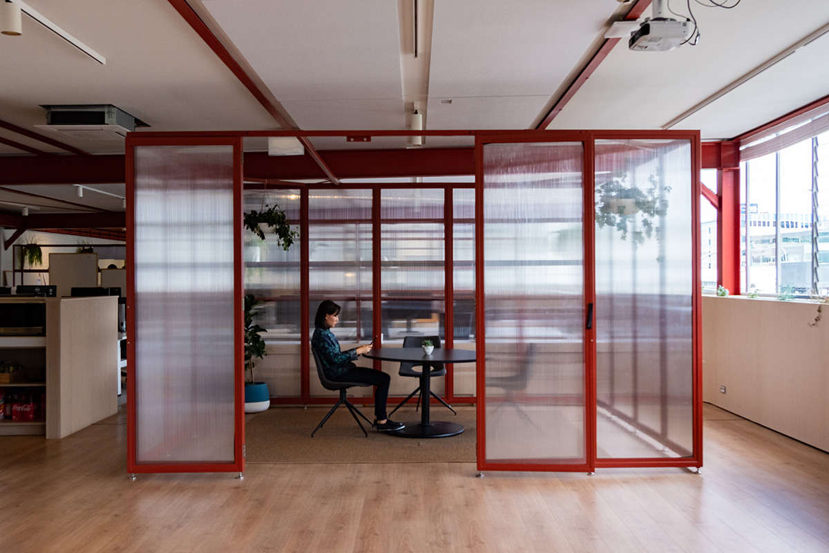
Housed within a 1960s era warehouse, the project is a small interior office fitout for Crimson Education technology teams in Newmarket, Auckland. Spatially open in planning, the design was conceived as a new timber grounded insertion within an existing brick and glass surround with heavy structural steel elements floating above. Colour and material palettes were then used as strong visual linkages to the workstations, storage units and meeting pods contained within.
Inspiration for colour was driven by the red tones of the existing steel protective primer coatings and the poetic way in which this tied in with Crimson Education's name. The decision was made to continue this theme and communicate all structural elements through this red tonal language, contrasting the boldness of colour against the softness of the timber and white background. “The crimson tone highlighting internal architectural elements deliberately contrasts and complements the backdrop of natural materials and shades of white, and the overall effect is clear and cohesive,” expressed judge Murali Bhaskar, Design Director of Boon Goldsmith Bhaskar Brebner Team Architects New Zealand.
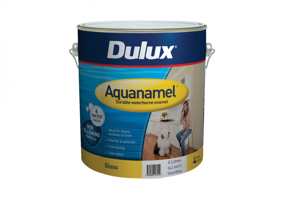
The range of Dulux products chosen allowed for complementary paint, protective and powder coat colour solutions. In-situ steel was primed in Dulux Luxaprime ZP and top coated with Dulux Aquanamel – Red Rock, with a gloss sheen, providing a reflective quality against the flatness of the plasterboard ceiling and acoustic panels. The free-standing meeting pods and shelving units were powder coated in Dulux Duralloy – Matt Pioneer Red as they are a mixture of aluminium and steel construction but were needing to be visually homogeneous and hard-wearing. Dulux Design & Colour Specialist Davina Harper adds, “All of us at Dulux are absolutely thrilled for Patrick and think this project represented not only an inspired use of colour but also the architecture and interior design talent we have in New Zealand."
Architects: Patrick Loo – OPL and Biran He - Crimson Education
Builder/Developer: Practec
Photographer: OPL
Client: Crimson Education
Dulux Colours: Dulux Red Rock, Dulux Matt Pioneer Red, Dulux Mt Aspiring, Dulux Southern Alps
Dulux Products: Dulux Duralloy Powdercoat, Dulux Luxaprime ZP, Dulux Aquanamel Gloss
®Dulux, Duralloy, Luxaprime and Aquanamel are registered trademarks of Dulux Group (New Zealand) Pty Ltd.
 Popular Products from Dulux
 Posts by Dulux NZ Technical
 Most Popular