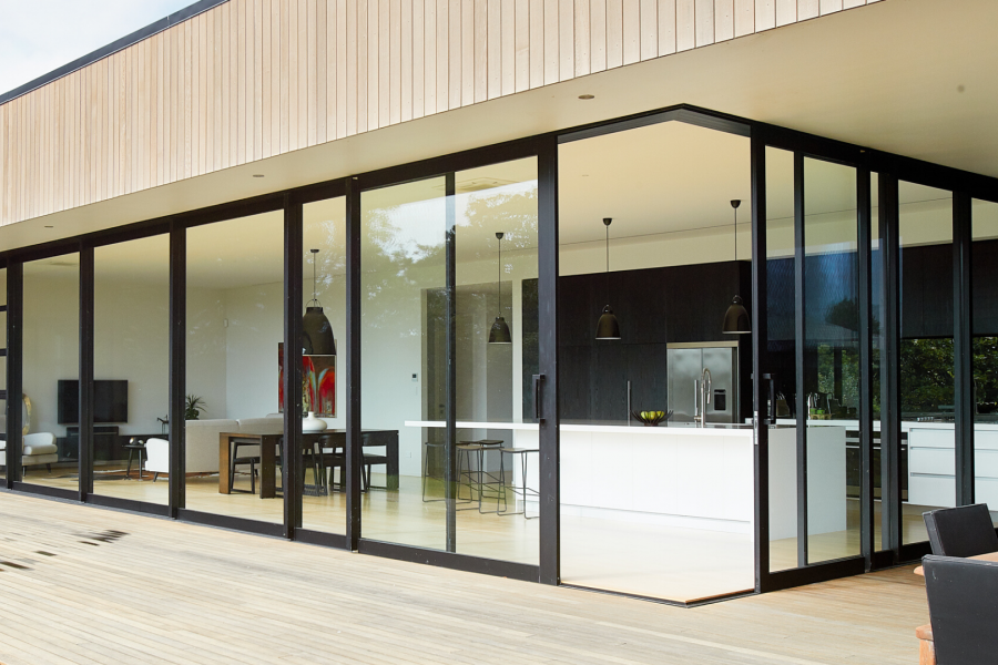
 VANTAGE Windows & Doors
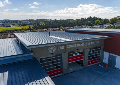
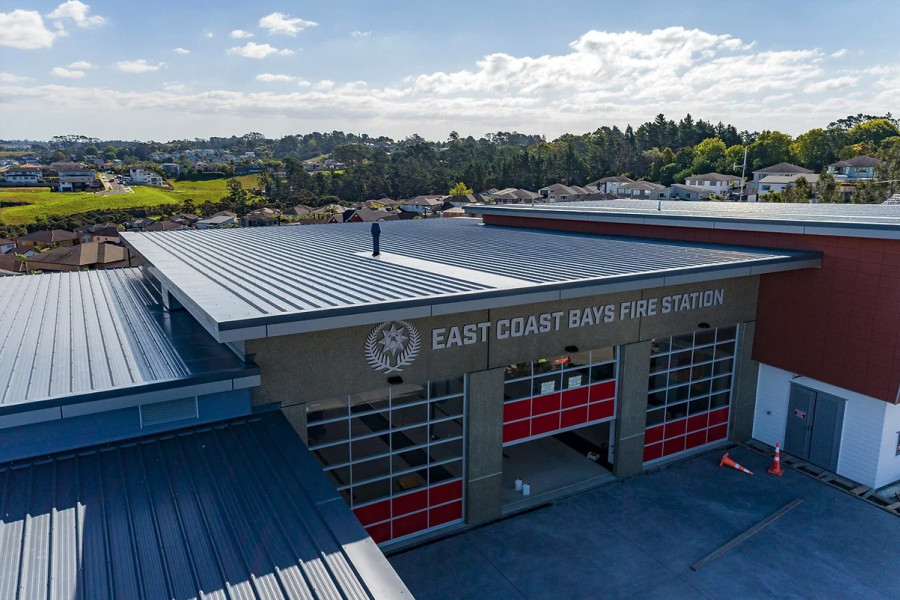
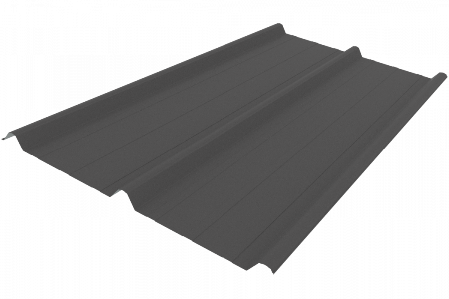
 Roofing Industries
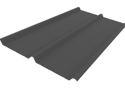
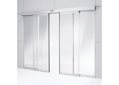
 dormakaba
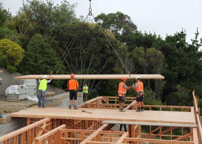
 XLam Cross Laminated Timber Panels
 SPAX
SPAX


 Bates Surfaces
 Case Studies
 JESANI
 Aero
Aero


 Dulux
Dulux


 Licensed")

")
")
 Compliant")

DuluxGroup recognises that commitment to sustainable management of their financial, environmental, and social impacts is fundamental to the success and well-being of both their business and their stakeholders. They aspire to deliver on safety and sustainability vision of "A Future Without Harm".
The DuluxGroup business has a strong heritage of continuous improvement in sustainability impacts. Examples are diverse and range from industry-leading safety performance and elimination of hazardous substances from finished products to significant reductions in waste to landfills from operations and participation in community support activities.
One of DuluxGroup's focus areas is to support the design of buildings that are accessible to everyone, regardless of their ability. According to Statistics New Zealand, one in four New Zealanders live with a disability, and this number is only expected to grow as the population ages. It is essential to consider accessibility features and universal design principles when designing buildings and DuluxGroup as a business recognise this premise.
Here are some of DuluxGroup's recommendations when specifying paint and coatings for our disabled, ageing, and neurodiverse community.
1. Environmental impact
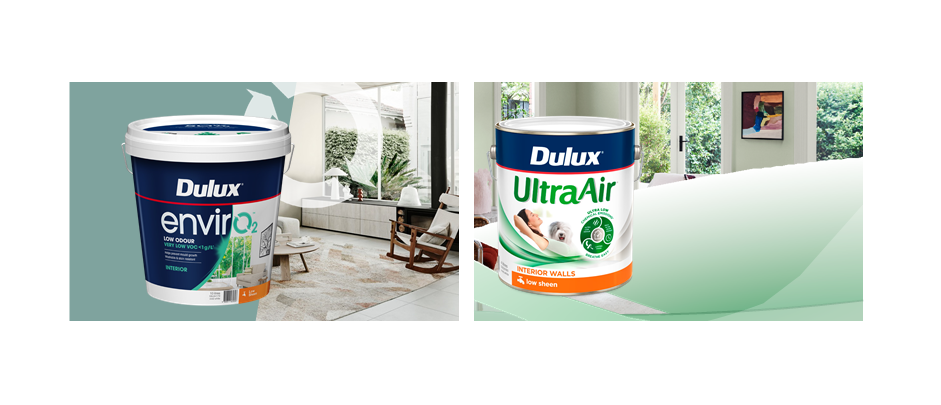
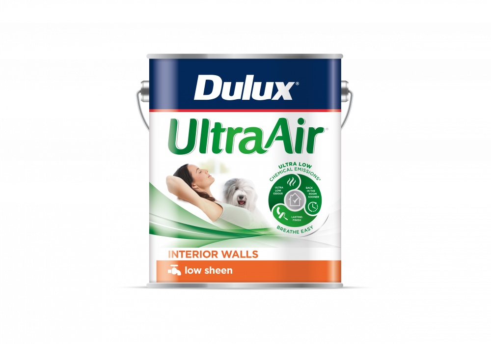
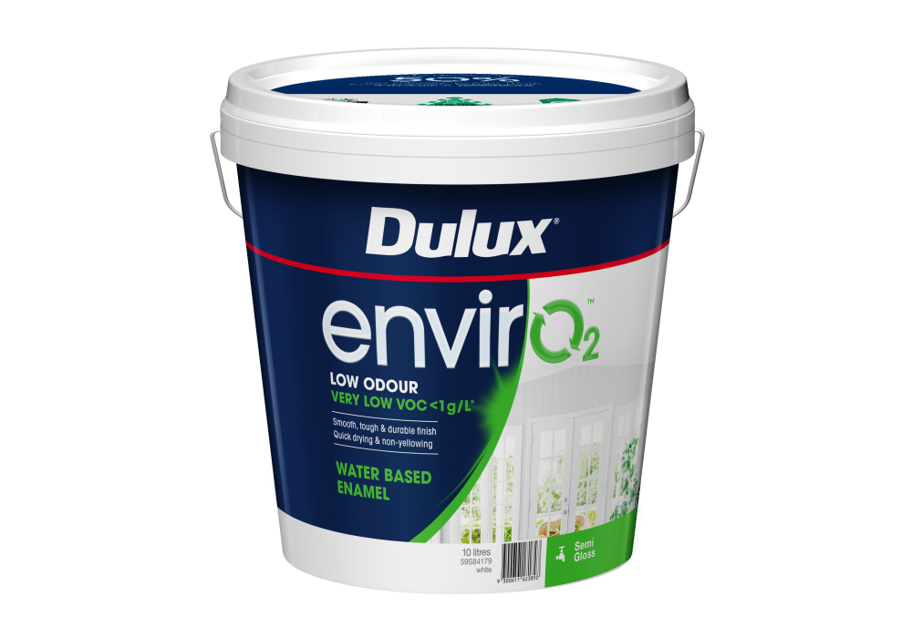
Painting with lower Volatile Organic Compounds (VOCs) and embodied carbon should be considered to minimise environmental impact. This reduces the volume of chemical emissions that damage indoor air quality, reduces odour, and allows rooms to return to service faster. Dulux strongly recommends water-based paints over solvent-based ones wherever possible. Nearly 95% of the decorative paints manufactured in New Zealand by Dulux are water-based. Dulux has been recognised globally for two of its flagship environmentally friendly products: Dulux UltraAir, and Dulux envirO2 by the Global GreenTag, a third-party eco-labelling scheme that assesses a company’s finished products and how they are made. Whilst these two products meet “ultra-low VOC” levels at less than 1g/L, Dulux's highly regarded Wash & Wear products are Low VOC (<16g/L) and Eco Choice Aotearoa certified for GreenStar and HomeStar use.
2. Added protective and preventative benefits
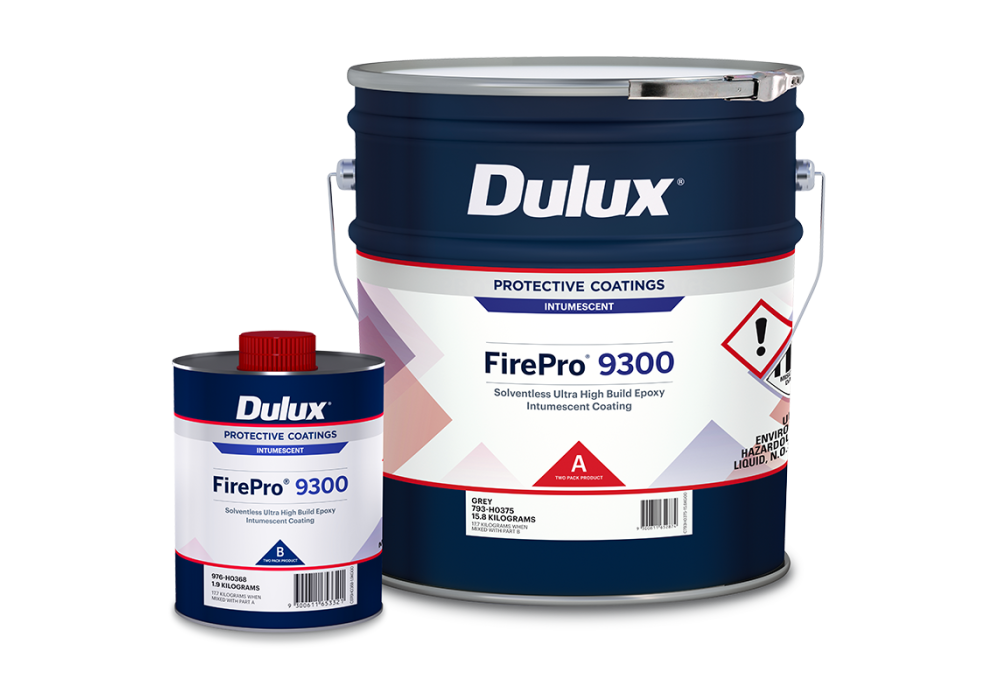
Specifying for certain areas, for example, corridors and escape routes, involves special care when it comes to fire resistance and should always include products which as a full 3-coat system meet the required Group Rating for the occupancy of that space. Dulux has tested systems that comply with the NZ Building Code Clause C3: Protection from Fire. Furthermore, where steel is included in the design it is paramount to maintain the structural integrity of the building allowing people to egress and fire crew to enter the building for the specified fire-rating period. Intumescent coatings such as Dulux FirePro 9300, a solventless, ultra-high build, epoxy intumescent coating are used for the fire protection of interior and exterior structural steel in these situations.
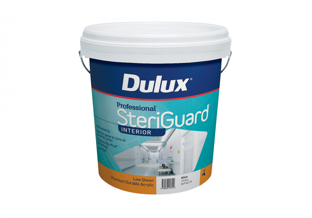
For healthcare environments, coatings such as Dulux Professional SteriGuard are a range of premium speciality paint products designed to support internal environments in settings where hygiene is important. It contains Bio-Pruf Technology, which when combined with clinical cleaning programs, helps assist in the protection against mould and mildew growth to keep surfaces clean and help maintain good indoor air quality. Furthermore, we also have our Wash& Wear Kitchen and Bathroom range which has been developed to withstand humid or damp environments. The hard-wearing surface formed by Wash & Wear’s exclusive Barrier Technology is fortified with powerful mould inhibitor and water-repellent properties.
3. Colour as a powerful accessibility tool
Colour can help people navigate for wayfinding, especially those with visual impairments. Understanding how occupants will use a space and the powerful impact colour design choices have on a building’s success, is important in the inclusive and accessible design process.
It is vital to make the most of luminous contrast and lighting design to enhance people’s spatial awareness and help them use their residual vision to navigate spaces both interior and exterior. Visually impaired people, often pause to gather information about a space or adjust to changing luminance. An obvious response, to those with limited colour knowledge, might be to maximise colour and contrast between different objects using for example black, white, and yellow. Luminance Contrast is the amount of light reflected from one surface as compared to the amount of light reflected from another surface. Australian / New Zealand Standard AS/NZ 1428.4.1-2009 requires Luminance contrast in a range of 30% to 60% based on the type of building elements.
Light Reflective Value (LRV) is a measure of visible and usable light that is reflected from a coloured surface when illuminated by a light source. The Standard sets out a minimum of 30% Luminance Contrast between two adjoining surfaces, for new-build and major refurbishment projects, to establish contrast between adjacent surfaces for ease of identifying exit ways in poor light conditions or for visually impaired people. Achieving colour and contrast successfully, particularly for critical surfaces must be considered when designing for the disabled community. The critical areas or surfaces include doors, skirting, general obstacles like furniture, and lighting.
4. Colour as a response trigger
Different colours evoke different emotional and physical responses, especially among certain people with disabilities. When designing for neurodiverse people, Red is considered to increase brain wave activity, heighten the perceived temperature of the room and, in some cases, raise heart rate and/or blood pressure. For some people, such as those with ADHD or other neurodiverse conditions, using red as a dominant colour is not advised.
Green is considered a healing hue as it is midway in the colour spectrum and can offer a balanced, calming feeling. Connecting to nature and the environment, green can lessen signs of agitation and stress. A cooler, muted shade of green can make a room feel larger and calmer. Bright green handles and knobs can provide an added layer of safety for the elderly too.
How to create compliant colour schemes
To help specifiers maximise the inclusivity and usability of a space, by creating colour schemes that are both aesthetically pleasing and comply with the visual contrast guidelines, the Dulux Colours of New Zealand fandeck and the Dulux World of Colour Atlas are both great tools.
These tools can be used to help enhance spatial awareness and navigation, aiding in the identification of key building features and contributing to safety.
For more information, get in touch with Dulux's team of Specification Consultants here.
 Popular Products from Dulux
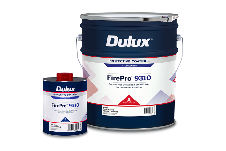
 Posts by Dulux NZ Technical
 Most Popular