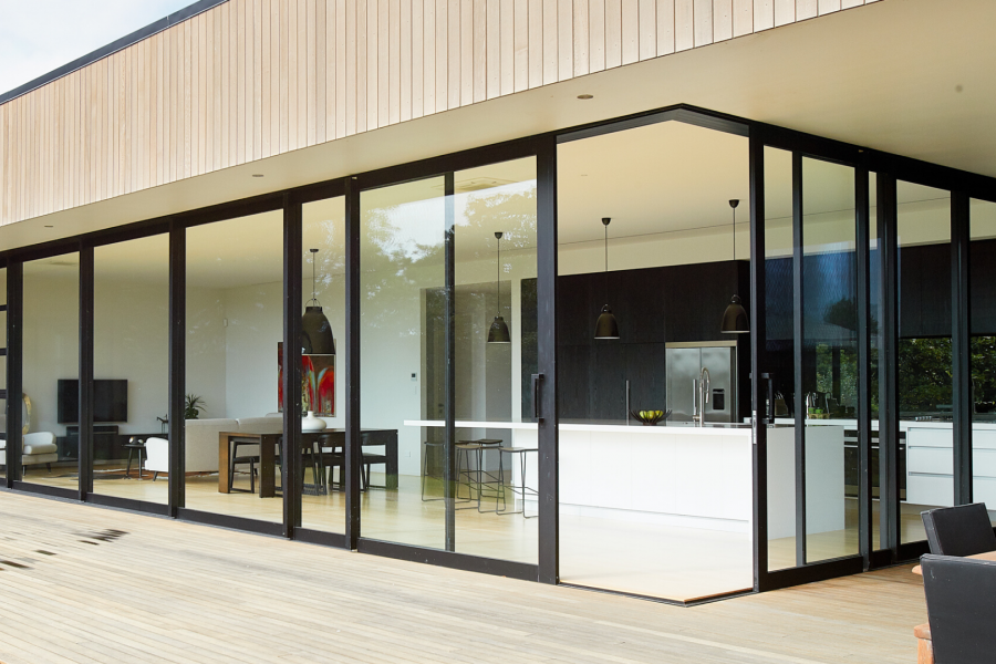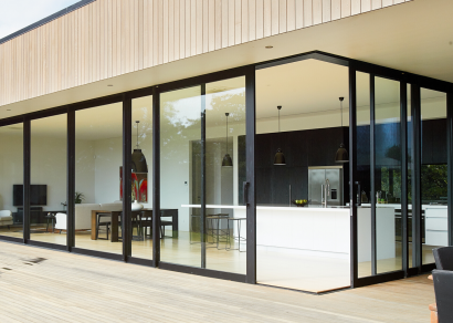
 VANTAGE Windows & Doors
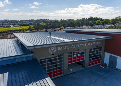
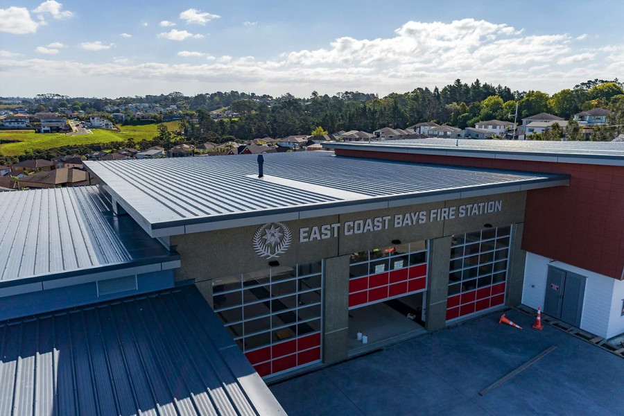
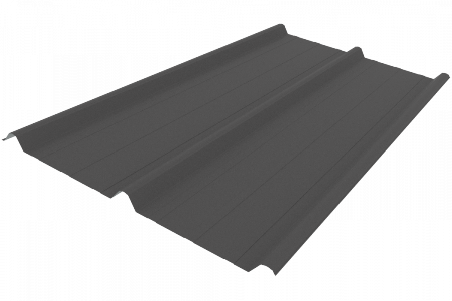
 Roofing Industries
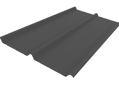
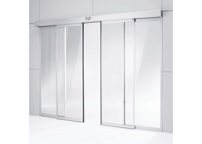
 dormakaba
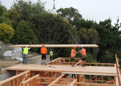
 XLam Cross Laminated Timber Panels
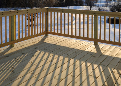
 SPAX
SPAX


 Bates Surfaces
 Case Studies
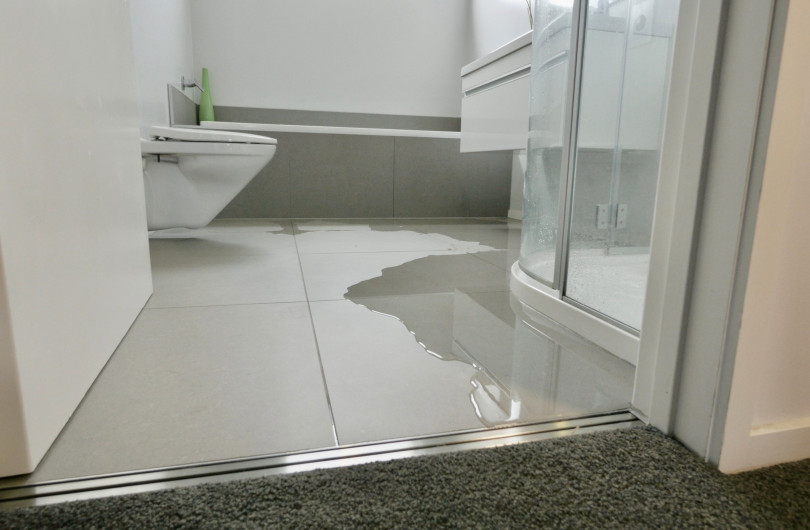
 JESANI
 Aero
Aero


 Resene
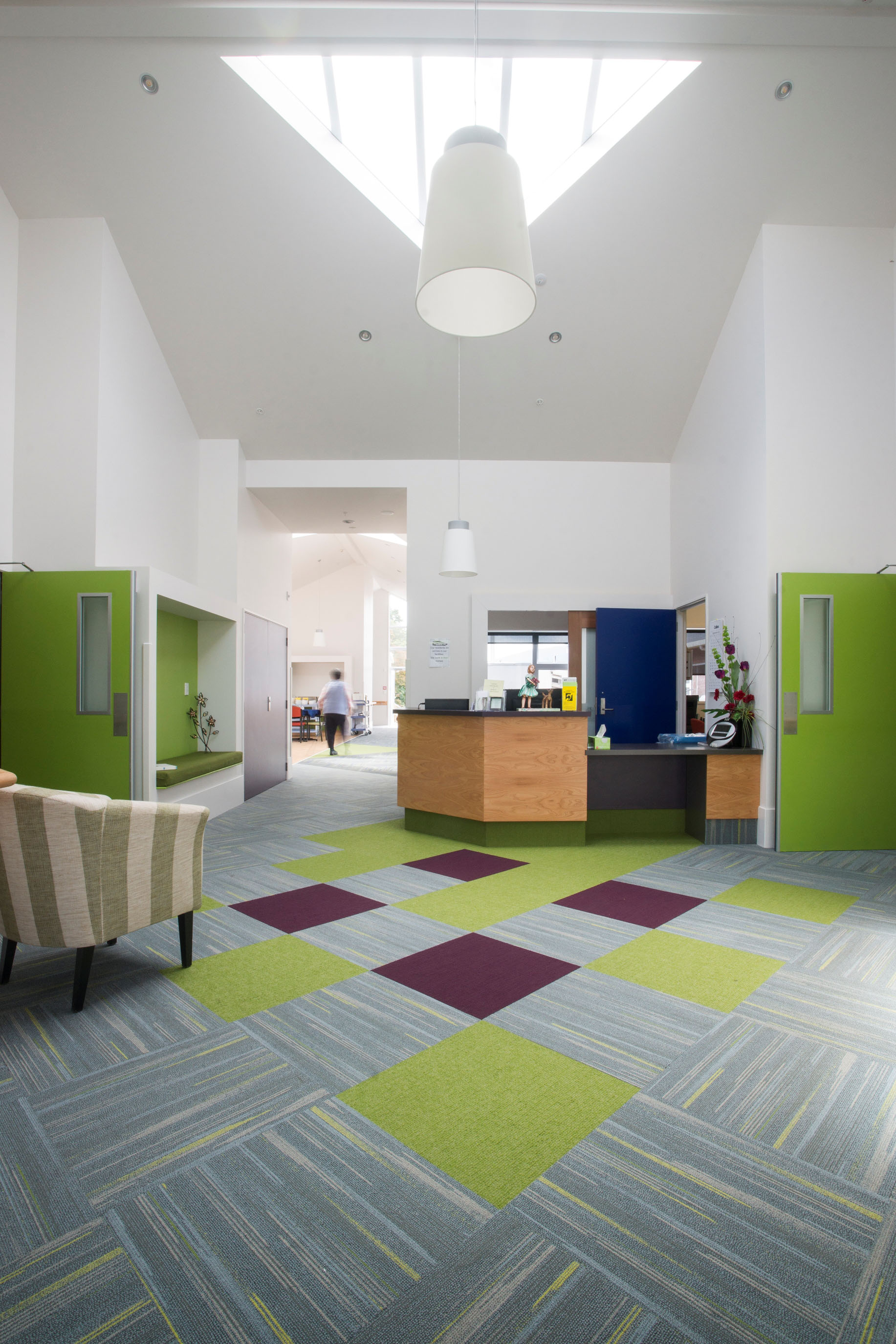


 Licensed")

 NEW
NEW
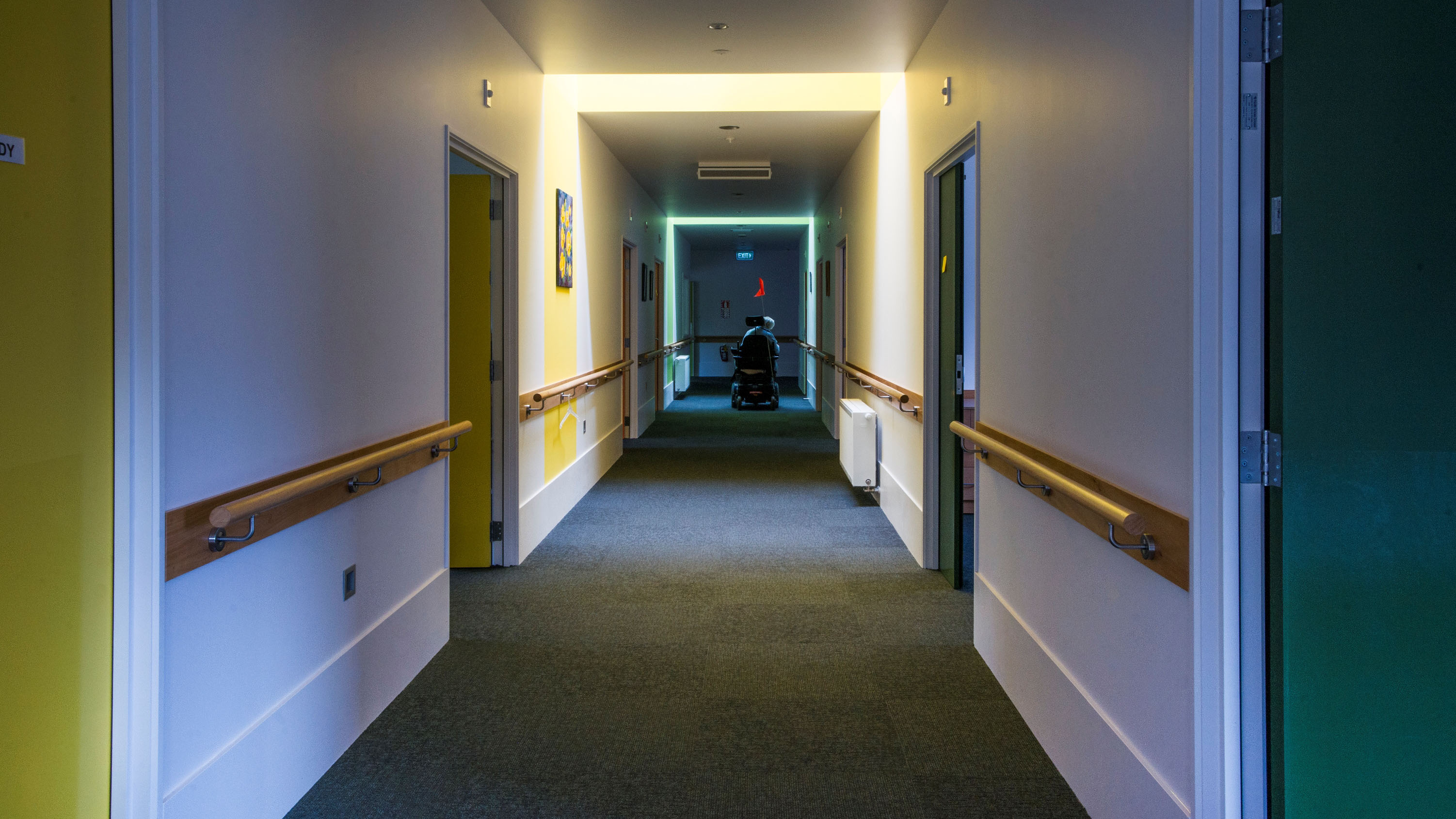
We’ve all been to a carpark building, jumped out of the car and hurried into the building, only to come back later wondering where we left the car. Luckily many carpark owners employ colour on each level which helps carpark users to navigate back to their car by remembering which colour floor they are on. The visual impact of a colour is more memorable than simply remembering a floor number.
Colour can be used for wayfinding to provide a trail through a building and is often used in large hospitals to help patients and visitors move directly to where they need to be.
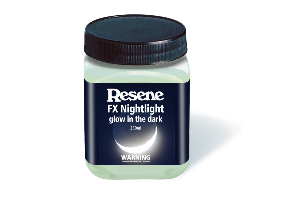
At night, glow-in-the-dark paints, like Resene FX Nightlight, can provide a contrast to the dark and help guide the way when the normal colours are no longer visible. Resene SmartTouch conductive paint can be used to turn the wall into a lightswitch, making it easier to turn on lights regardless of height, disability or darkness.
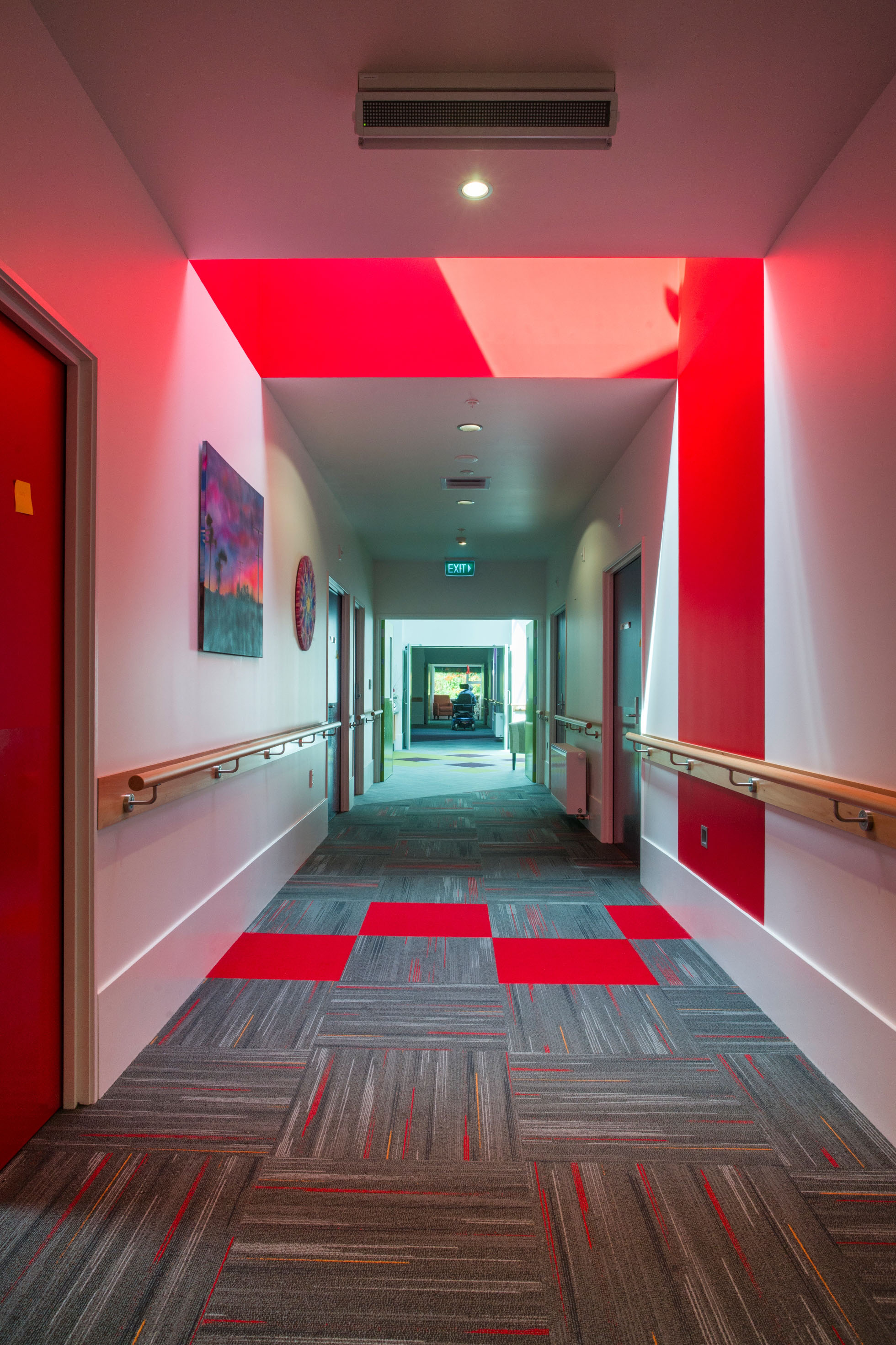
While it can be tempting to try and highlight everything, too much contrast can quickly become overwhelming. Instead, focus attention on a small number of things that are most critical to those trying to use the space — this might be areas like the exit door, the light switch and stair edges. Avoid too much pattern as this can quickly overwhelm.
Common areas to use contrasts are where adjoining surfaces meet that people must navigate — think door frame meets door, floor meets wall or the contrasts on the edge of paths and stair edges to help highlight the edge.
Contrasts don’t need to be garish. Look to the LRV (Light Reflectance Value) of the chosen materials colour palette and aim to have at least 30% LRV difference for contrasting surfaces. This will provide, at the very least, a lighter and darker colour. In addition to altering the depth of the colour, look to complementary colours, on opposite sides of the colour wheel, such as blue with yellow, for additional contrast.
Changing levels, such as up and down stairs or paths, tend to come with higher injury risk than flat surfaces. Ensure colour contrasts are used to visually show the changes in level and provide contrasting coloured handrails where possible to assist with navigating these areas.
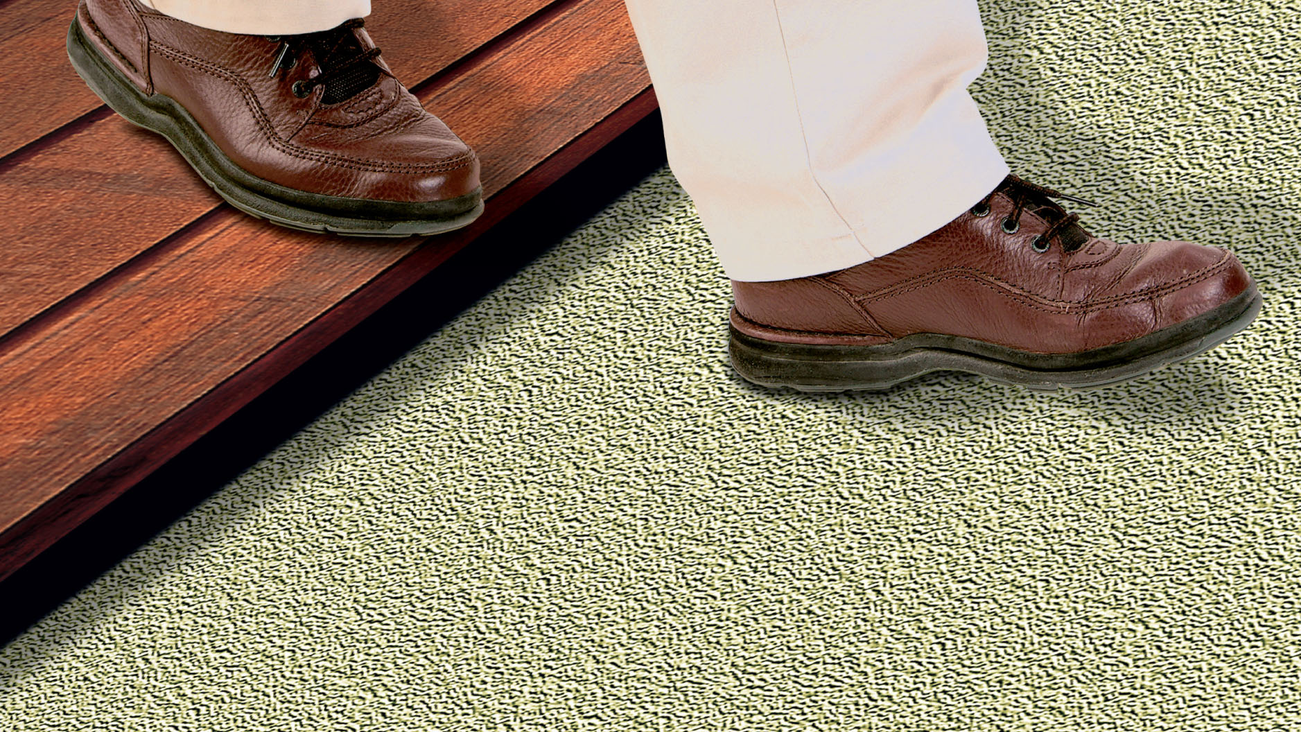
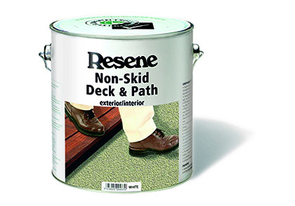
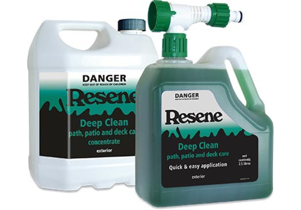
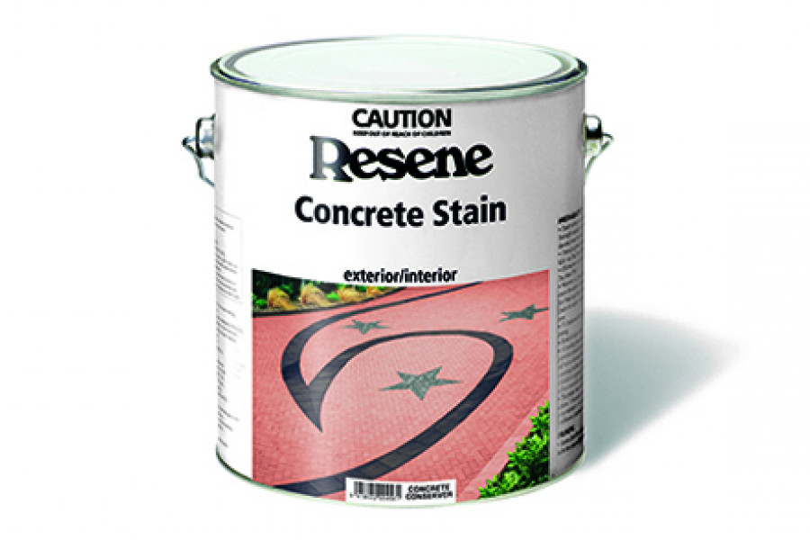
Any areas subject to water can become dangerously slippery when wet. This is especially common in exterior areas, where moss and mould build-up adds another level of danger. Specify Resene Non-Skid Deck & Path for these trafficable areas. The grit finish will help reduce the build-up and a contrasting colour to provide visual contrast too. Implement a maintenance plan that includes regular cleaning of moss and mould, with a long-acting product like Resene Deep Clean to minimise the risk of slips.
 Popular Products from Resene
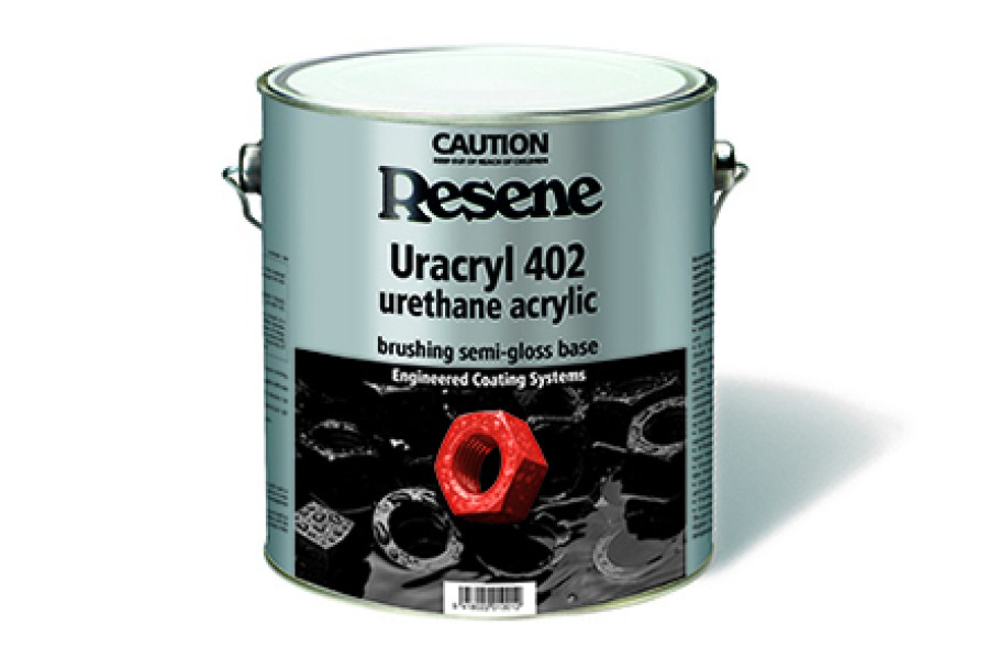
 Posts by Resene Technical
 Most Popular