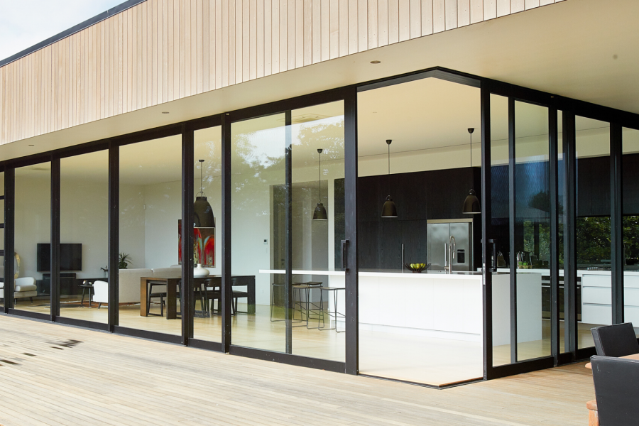
 VANTAGE Windows & Doors
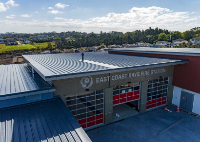
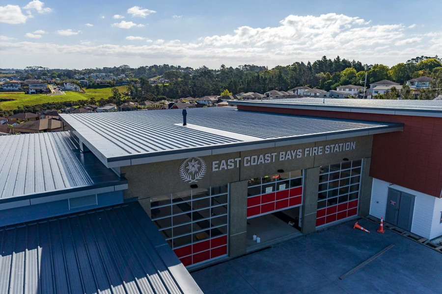
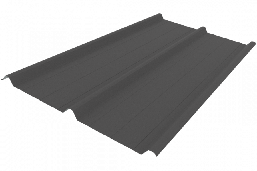
 Roofing Industries
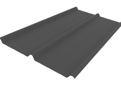
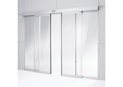
 dormakaba
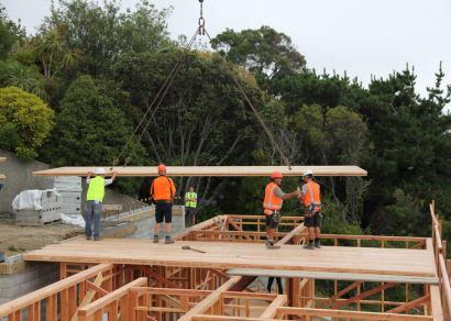
 XLam Cross Laminated Timber Panels
 SPAX
SPAX


 Bates Surfaces
 Case Studies
 JESANI
 Aero
Aero


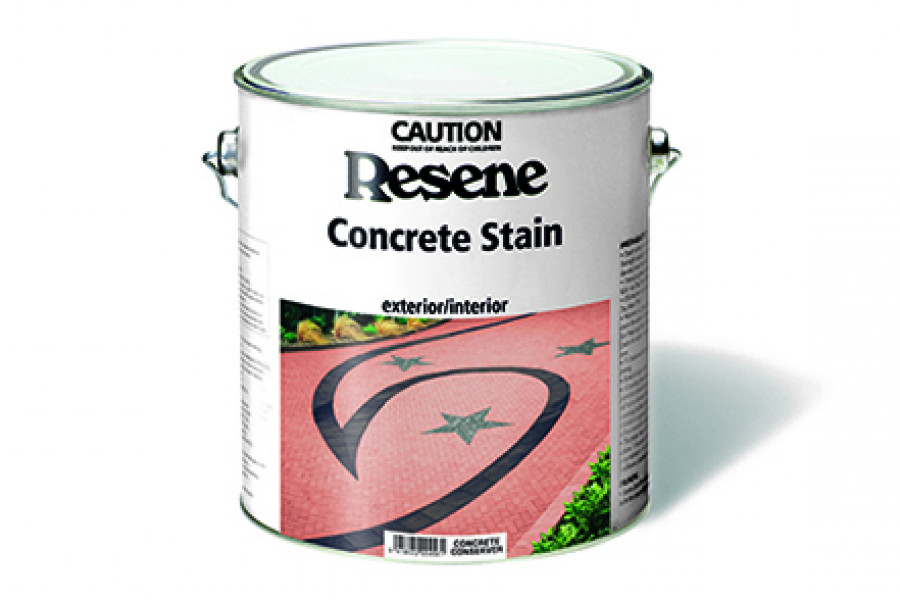
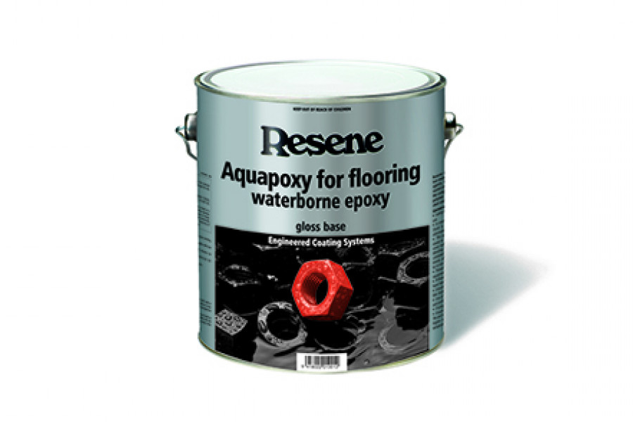
 Resene
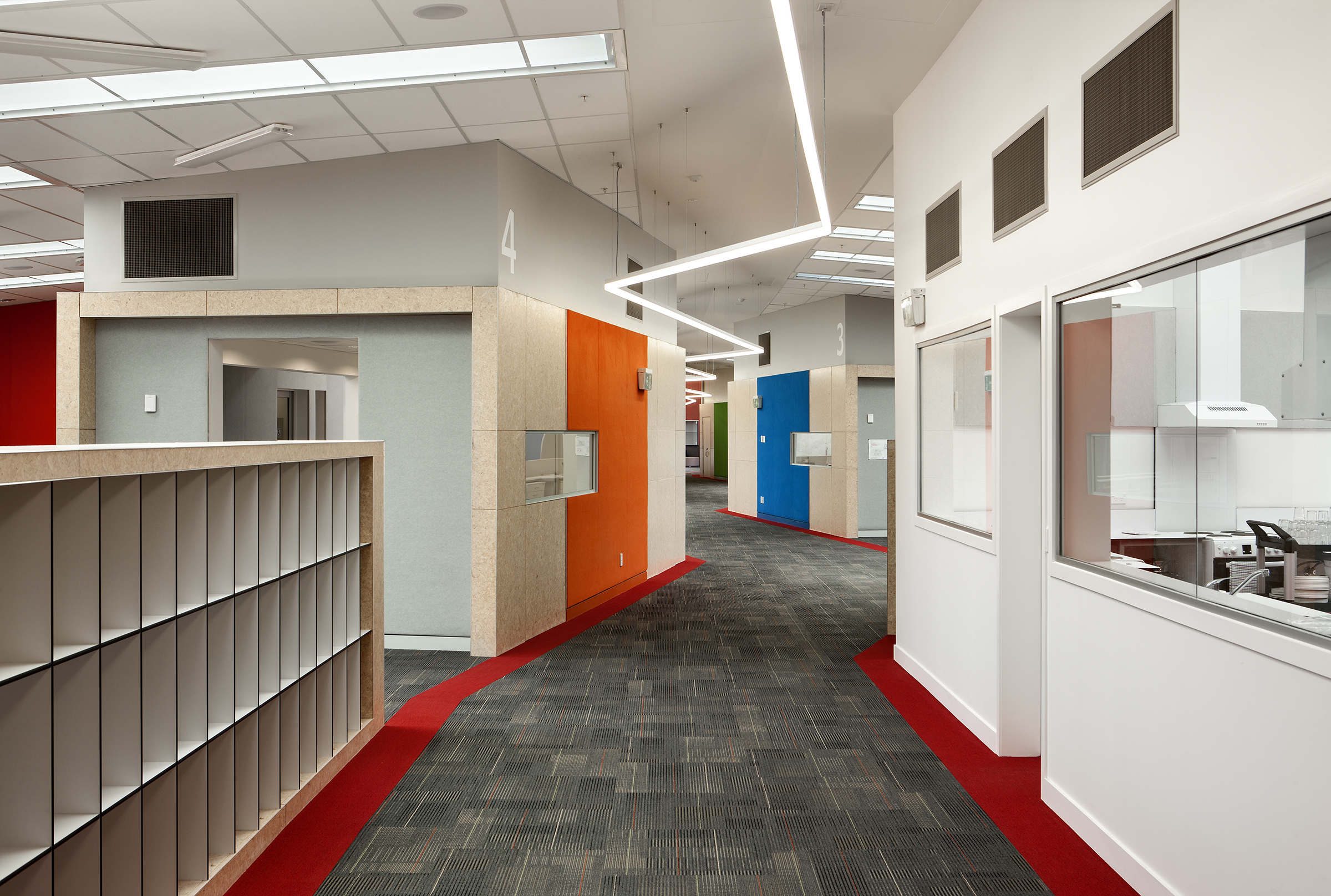


 Licensed")

 NEW
NEW
Traditionally colour contrasts were focused on aesthetic appeal, and if two colours looked good compared to each other, the colour contrast was usually considered to be acceptable.
With a growing focus on building accessibility and usability, carefully choosing colours that contrast well helps people use and navigate buildings. And it's not just for those with diminished eyesight. Just like traffic lights and signs used on the road, colour contrasts used well in buildings can help all those using a building.
Light reflectance values are a visual measure of the way the physical colour looks. So it doesn't matter if comparing two cans of paint — if the colour is identical, then the LRV of both cans will be the same.
LRV (Light Reflectance Values) work on a 0-100% scale, with 0% being black and 100% being white. A 30% difference in light reflectance value (LRV) tends to be the starting point for creating a colour contrast. So if contrast of 30% LRV is needed, then a colour of say 40% LRV and 70% LRV will be needed to give the required colour contrast difference of 30% LRV.
This 30% difference gives a good start point for a colour contrast. However, even with two colours with LRV differences of 30%, designers could end up with a dark green and a lighter green, which wouldn't necessarily be enough contrast for someone who is colour-blind. Ideally, as well as a strength difference designers would also use contrasting colours (e.g. yellow with blue), different sheen levels and good lighting to help emphasise the colour contrast.
Consider who will be using the building the most or who may have the most difficulty using the space, and check colour choices will also be discernible by them.
Resene light reflectance values can be looked up in the Resene online colour library. Specifiers can search by colour or use the light reflectance search option to identify colours with specific LRV values. LRV values are also included in most Resene colour charts as a quick handy reference.
When choosing adjoining materials or colours from different suppliers, it is always recommended to visually check the colour contrast using physical samples. Some manufacturers may use other methods to calculate their LRV. If two similar looking colours have very different LRV, that is a warning sign to ask each manufacturer how they measure their LRV value. LRVs only normally apply to solid colour finishes not stained finishes, so when comparing stains it is necessary to visually check a sample of the stain over the timber it will be used on to ensure there is sufficient contrast vs adjoining surfaces.
Once colour contrasting has been decided, placement of the colour contrasts is also important to ensure that the areas of most importance are highlighted. These may be doors vs door frames, emergency exits/tools, walls vs floors, or even just using specific colours as a wayfinding device to help users find their way around a building. Common areas to use contrasts are where adjoining surfaces meet that people have to navigate; think floor meets wall, door frame meets door, contrasts to mark the edges of paths or contrasts on stair edges to help make it easier to see where the levels change.
Blocks of colour are recommended, rather than heavily patterned spaces. If there is too much contrast within a surface and within adjacent surfaces, it can be very tiring for the eyes and the contrasts can start to compete with each other.
Always consider lighting, both natural and artificial, when planning colour and surface finishes and make the most of natural light. Very light colours and glossy surfaces can create glare — it may be best to opt for a slightly darker colour, lower sheen finishes and more diffused lighting.
Any colour has the ability to be a contrasting colour, when paired up with the right contrast. Chosen well, colour contrasts should enhance the space for all users.
 Popular Products from Resene
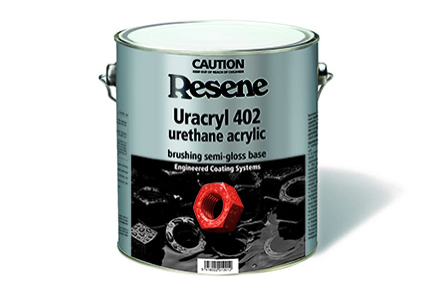
 Posts by Resene Technical
 Most Popular