The majority of the library's interior was finished in neutral tones, with a very subtle tonal change - seen through the geometry of many of the internal surfaces - used to create interest within the space, with natural and artificial lighting used to enhance this tonal effect.
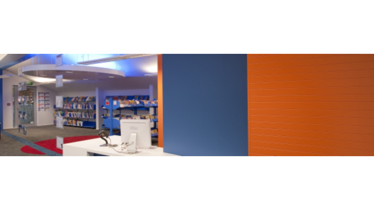
A vibrant palette of colours were used to highlight key areas within the library, with the inspiration for these hues coming from the school site and school colours. Citric orange walls indicate the entrance and librarian spaces, with an electric blue bulkhead and carpet detail (which divides the space into two) creating an enclosure for the reading zone, as well as enhancing the openness to the adjacent learning area.
A large circular up-lit disk on the ceiling and an opposing red disk formed in a heavy pile carpet in the centre of the library, have been used to help define a small 'lounging' space and to soften the modernist lines of the room.
The library is further divided by vertical display columns and walls which have been lined with muted coloured pin boards. These areas provide a space for students to display their work, allowing them to 'stamp' their mark on the library and provide their own colour to the space.





 Case Studies






 Popular Products from Dulux


 Posts by Dulux NZ Technical
 Most Popular