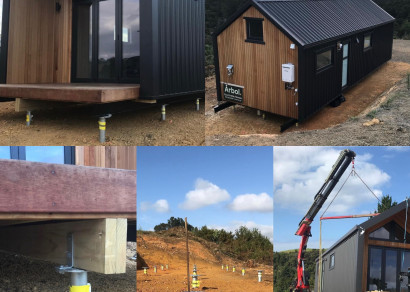
 StopDigging!
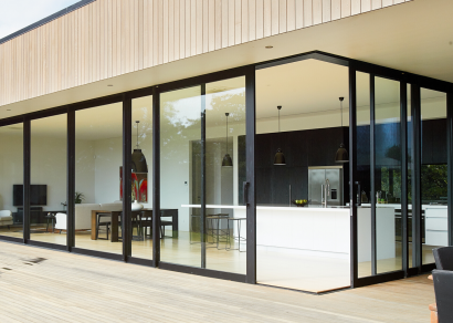
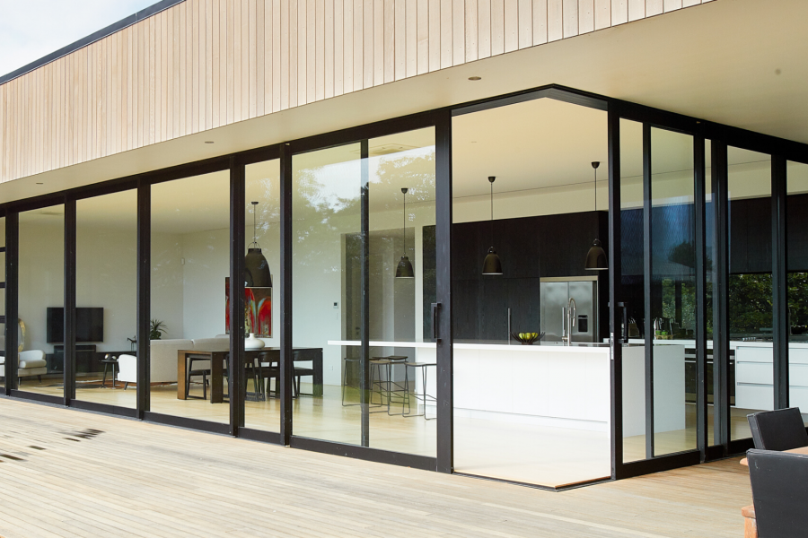
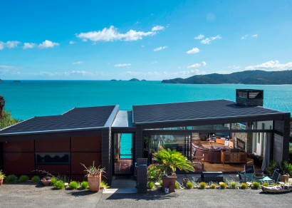
 VANTAGE Windows & Doors
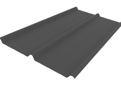
 Roofing Industries
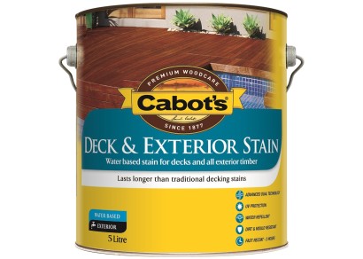
 Cabot's
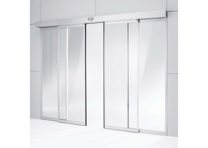
 dormakaba


 Prolam
 Case Studies
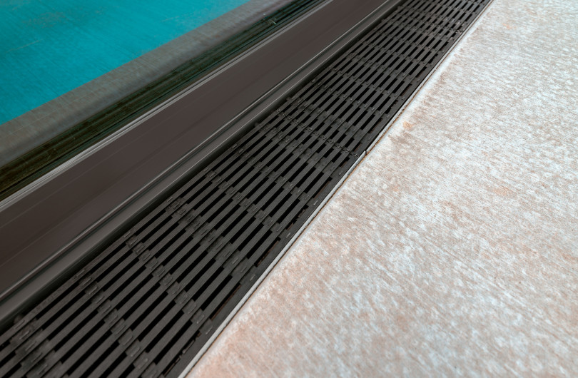


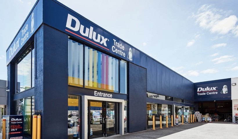
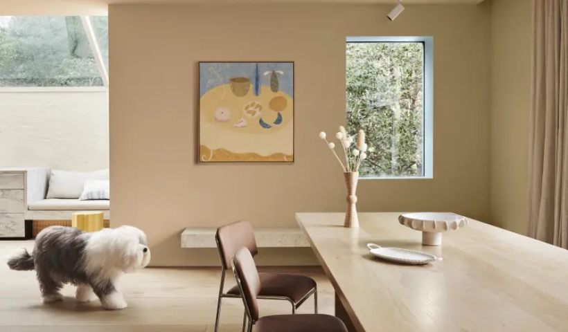
 Dulux
Dulux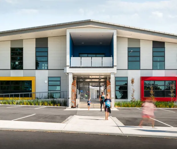


 Licensed")


Background
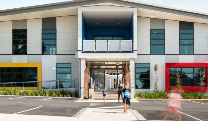
Situated east of Whakatāne and just metres from the rugged eastern coastline of the Bay of Plenty, Ōhope Beach School has a roll of more than 300 pupils from Year 0-6, and offers its pupils arguably one of the most inspiring learning environments in New Zealand.
The challenge
Material and paint selection needed to be key considerations to ensure a durable and easy to maintain building.
Exterior weather protection
The school is built in an exposed position in the valley with prevailing winds and sea spray from the coast, meaning the new building needed coastal weather durability.
High-traffic areas
With high usage by a couple of hundred primary-aged students, cleanliness and hygiene is another factor that needed to be considered.
Protection and aesthetic appeal
Prior to Ōhope Beach School’s redevelopment, the school lacked both colour and presence to the street. It was important to both brighten up the school and represent cultural identity.
The Solution
Finding a solution that included cultural representation through colour while incorporating coastal weather durability was key for Ōhope Beach School.
Durable exterior protection
The exterior masonry of the school was painted with Elastomeric 201. This was chosen for its highly flexible, extremely weather resistant properties, and Weathershield for the other cladding and soffits.
The windows, aluminium joinery, entry gate and stair screen were all powder coated. The Dulux Duratec range was chosen for this due to its high-performance colour retention and gloss specifications and ensures a durable and easy to maintain building.
Durability for high-traffic areas
The school interior was painted in Wash & Wear Kitchen & Bathroom for its stain resistance, washability and anti-bacterial properties. All the walls were brush and rolled, and the doors and trim spray finished.
Attractive, colourful and durable solutions
A pop of colour has been added to a variety of surfaces throughout the school. To create a playful feel upon entering, poles, bay windows, frames and aluminium joinery all share the bright blue, red, yellow and green powder coat colours. Each colour has significant meaning and is taken from the primary colours found in the school’s logo. Blue represents the school’s proximity to the ocean, red and green represent New Zealand’s native pohutukawa tree and yellow represents the sand found on Ōhope’s coastline.
With the addition of brightly coloured picture windows to the neutral exterior and new landscaping, the school now sits on the forefront of the road with much-needed vibrancy. Colours are used to portray the surrounding environment and tell the stories of the land. The stories of the region are weaved into the colour palettes used on the school's exterior.
“We are proud of our involvement in creating such a unique place at the heart of Ōhope community, situated in beautiful natural environment overlooking the sea” — Jennis Lee at Ignite Architects.
The school was Dulux Colour Awards 2020 Finalist for Commercial and Multi-Residential Exterior.
The team at Dulux leverage their deep expertise to support architects, interior designers, builders and engineers to design and build with confidence.
Image Credits: Dennis Radermacher
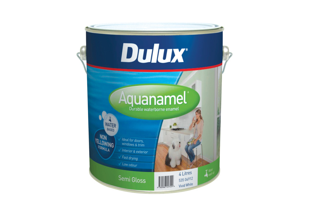
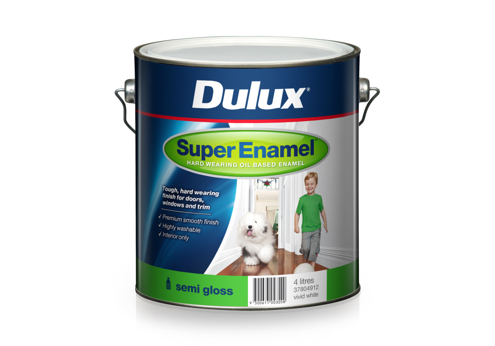
 Popular Products from Dulux

 Posts by Dulux NZ Technical
 Most Popular