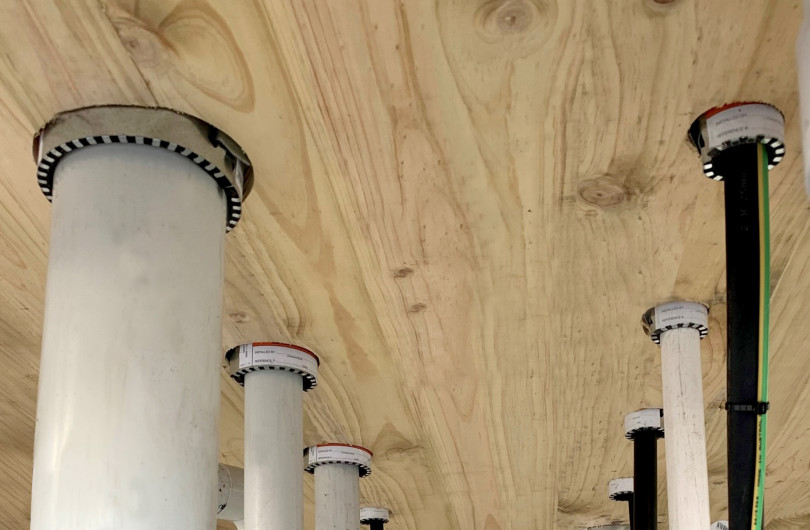
 StopDigging!
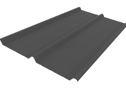
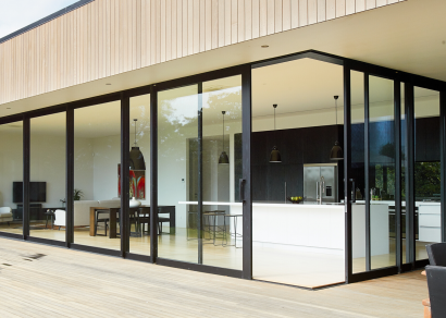
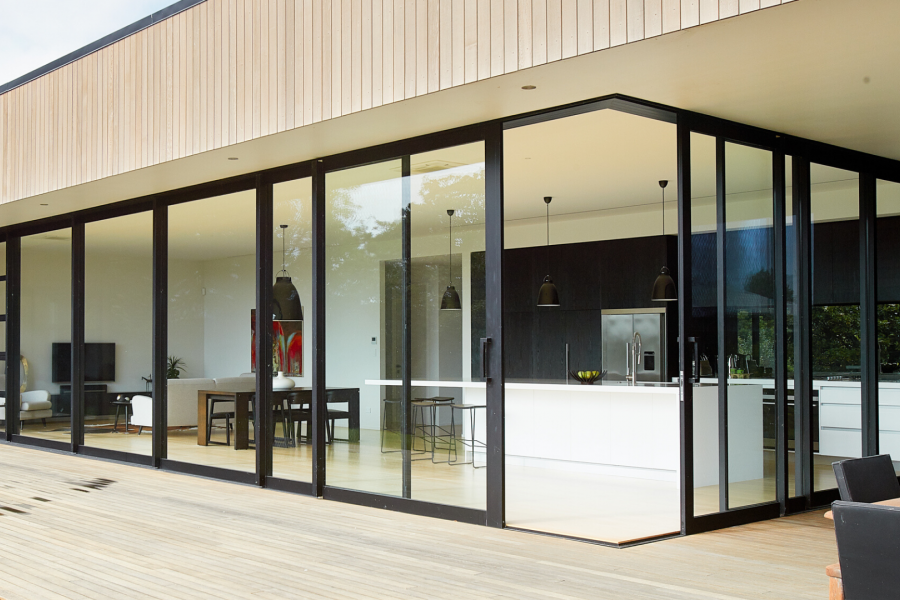
 VANTAGE Windows & Doors
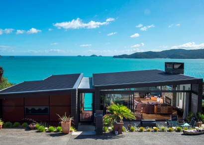
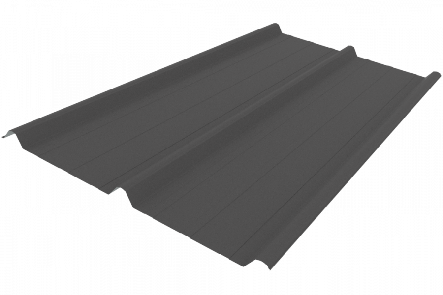
 Roofing Industries
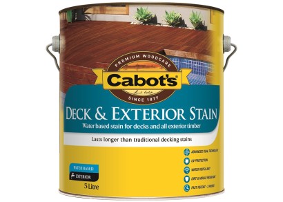
 Cabot's
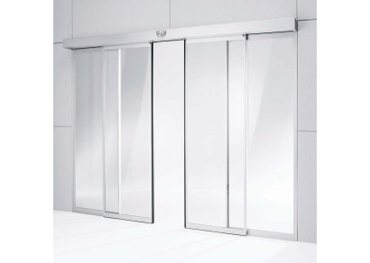
 dormakaba


 JESANI
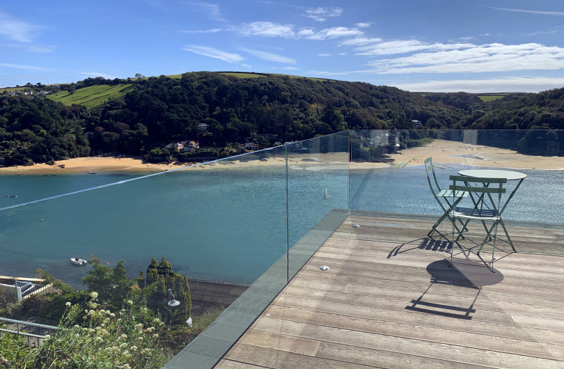
 Juralco Aluminium


 Dulux
Dulux

Like everything there are advantages and disadvantages with each of these tools.
But how you can be sure of a colour's exactness in a magazine, on a computer screen or in samples and test pots? Each has their advantages and disadvantages.
Print (magazines or inspirational booklets)
These are great for getting ideas of what different colours look like together, what schemes may be in fashion or what might look good in different styles of dwelling.
The colour accuracy achievable in this type of publication is improving but is not yet good enough to rely on to get the exact shade represented on the page. The CMYK print process is limited to producing colour as a mixture of cyan, magenta, yellow and black. And then when photography is involved there is variation on the way colour is perceived due to lighting and the influence of surrounding colours. Our recommendation is to not use these as a true representation of the colour, but rather enjoy the scheme and use it to create your own inspirations.
RGB (computer screens)
Dulux present all of our colours online and these are displayed using RGB values. Dulux provide RGB values for all of our colours and have downloadable colour swatches on line so you can represent colours on your computer screen and drawings. Because these colours are made up from a mixture of red, green and blue and there are variations between computer monitors RGB values are only a close representation of the actual paint colour you will get.
Colour controlled deposits (colour palettes/cards or colour chips)
These are virtually identical representations of the colour you will get from paint. Typically they are a made using a lacquer specifically designed for the purpose of producing colour controlled collateral.
Their main limitation is the size of the chips. The Dulux World of Colour atlas, colour palettes and fandecks group colours together to provide a wide selection of similar shades on a theme so you can narrow down your options quickly.
Colour samples (often refered to as brushouts)
These are large swatches of colour that are an excellent standard for the colour that will be achieved on the job. Sometimes they are actual paint drawn down on card, but more often they are an accurately colour controlled lacquer specifically designed for the purpose of producing colour controlled collateral.
Colour samples can be ordered from a number of companies for quick delivery to specifiers. Free Dulux samples can be ordered.
Physical paint (sample pots)
This is the ultimate test of what the colour in paint will actually look like. Typically a consumer will purchase these and they are often less useful for specifiers.
There is no one particular way that works best. Most professionals find a way that meets a balance of a number of needs. Our experience is that the process generally follows an order that increases the size of the sample and accuracy of the colour the closer you get to the end result.
-
Something inspires us or challenges us to look at colour, whether it be inspiration from a magazine or the need to complete the colours on your current project
-
Colours are “short listed” by using an atlas, palette cards or fandecks.
-
Confirmation is made by ordering larger samples from the manufacturer or via sample pots (aka testpots)
How you get there is up to you, but each tool is there for a reason. Have some fun with colour and make the most of the extensive range of colours and tools available to you.

 Most Popular
 Popular Products